In my job as Art Director, often there is little or no information as to what a client is looking for in a design for print material, websites or app interfaces. Especially when the brand is new. There are five simple steps you can follow to establish a look and feel from scratch confidently.
Design Objectives
1. The first objective of the design should be to create a brand image, which aims at being:
Distinct: Look different to the competition, but keep in mind not to challenge conventions for the sake of distinction, only if it really adds value.
Appealing: Visual aesthetics are crucial to engage consumers emotionally.
Consistent: Always use the same approach for design over a long period of time across different channels (print, web, apps etc).
2. Create a sense of trust with the brand through:
Appearing competent: Imitate the look of trusted websites and yet be distinct.
Appearing honest: Over-polished websites that look like advertisements undermine the content's credibility (unless of course it's an ad).
Being culturally relevant: Don't use imagery that leads to misunderstanding or colors that can lead to contradicting associations.
Protecting privacy: Visualize (i.e. through pad-lock icons) which contents are private and will not be shared.
Guaranteeing security: This is vital, especially for trust in ecommerce, however there is little design can do to address this point.
3. Create memorable brand experience by:
Stimulating engagement: Especially online, consumer value lies in creating a dialogue, therefore the design has to address the importance of user generated contents.
Leaving with a positive feeling (online only): Pay enough attention to the design of so called thank-you-pages. At the end of a user-journey, the user has to feel appreciated and confident. This aims at stimulating return-visits.
Colors
Colors are central to create an atmosphere and associations, however there is great diversity in the use of colors and their associations between cultures.
For example green may create a vibrant and energetic atmosphere and is associated in Western cultures with youth, environmental friendliness etc. In China however green is associated with death. Careful consideration is required when designing for an audience of other cultures. Generally one can say, the less specific the use of colors is, the broader the reach of the audience.
Imagery
Every picture tells a story, so careful consideration of photography for the brand is important because they stimulate behavioral change.
Photography can be used in various ways, from purely informative to aspirational or as part of an overall atmosphere. Images for most brands are positive, with warm hues and high saturation. They should enhance the trustworthiness by looking authentic, not staged (no looks into the camera's lens).
Go for images that are human, observational, intimate and engaging. Avoid any image that looks cheesy or like stock photography. Also avoid visuals that feel patronizing or talking down to the viewer, like in a schoolbook or manual.
Typography
The most important distinction is between fonts for headlines and fonts for body copy. Body copy should be in a font that is easy to read and for online, it should be live text (i.e. Arial, Georgia, Tahoma). Headlines can have any font that represent the brand's overall image best. Generally the most sans-serif fonts are used for corporate brands who target broad audiences. The more fancy a font, the more specific its emotional appeal, which limits its reach.
Use of the logo
Branding is very often misunderstood with merely creating a logo. The logo however is a central part of the design process and needs to address all the mentioned points to create the correct associations with the brand: The color, imagery or icons and typography.
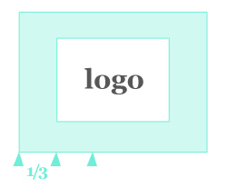
Common dos and donts: The logo should leave enough space around it, to make it visually stand out and emphasize its importance. It should never be squashed or altered in any way (no other colors than the defined brand colors etc). blog comments powered by Disqus